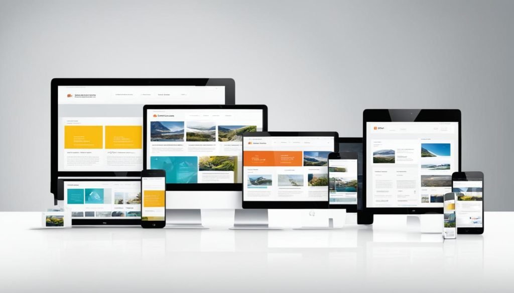
In today’s digital landscape, responsive web design is crucial to ensuring a seamless and engaging user experience across all devices. With the increasing use of smartphones and tablets, it is essential for websites to adapt seamlessly to various screen sizes and maintain their mobile-friendly nature. The key to achieving this lies in mastering adaptive layout and creating a user-friendly web design that caters to the needs and preferences of users, regardless of the device they are using.
Responsive website optimization is at the core of responsive web design. By employing a device-agnostic approach and adopting a mobile-first strategy, businesses can ensure that their websites are SEO friendly and rank higher in search engine results. This means considering factors such as loading speed, content hierarchy, and navigation to provide an optimal user experience for visitors on desktops, smartphones, and tablets.
By implementing cross-platform web design techniques, companies can reach a wider audience and engage users on multiple devices. Whether it’s a small business or a large enterprise, embracing responsive website development is essential for staying competitive in today’s digital age.
Key Takeaways
- Responsive web design ensures a seamless and engaging user experience across different devices and screen sizes.
- Mobile-friendly websites are essential for catering to the increasing use of smartphones and tablets.
- Optimizing websites for search engines through responsive design helps improve rankings and visibility.
- A device-agnostic and mobile-first approach is key to responsive website optimization.
- Responsive website development allows businesses to reach a wider audience on multiple platforms.
Introduction to Web Design Strategies
Web design is a dynamic process that aims to create a seamless and engaging user experience by combining aesthetics with functionality. It encompasses various elements such as the visual layout, content hierarchy, load times, and accessibility to deliver a website that captures attention and provides value to users. In today’s digital landscape, web design goes beyond creating visually appealing websites; it focuses on user experience and optimizes the site for different devices.
Responsive web design plays a crucial role in effective web design strategies. It ensures that websites adapt seamlessly to different devices, providing a consistent and user-friendly experience. With the increasing use of smartphones and tablets, it is essential to design websites that are not only visually attractive but also optimized for mobile use. Responsive web design achieves this by utilizing flexible grids, proper content hierarchy, and optimized load times to enhance the user experience across all devices.
When designing a website, it’s crucial to consider both aesthetics and functionality. The visual layout should be visually appealing and aligned with your brand identity, while the content hierarchy ensures that important information is easily accessible to users. Load times should be optimized to avoid frustrating users with slow-loading pages. Accessibility is another vital aspect of web design, ensuring that all users, regardless of disabilities or impairments, can access and navigate the website seamlessly.
By implementing effective web design strategies, you can create a website that not only looks good but also provides a seamless user experience. The next section will delve deeper into the differences between responsive and adaptive web design methodologies.
Key Considerations in Web Design Strategies:
- Aesthetics: Design visually appealing websites aligned with your brand identity.
- Functionality: Ensure optimal performance and provide user-friendly features.
- User Experience: Focus on delivering a seamless and engaging experience for users.
- Visual Layout: Arrange content in a visually appealing and intuitive manner.
- Content Hierarchy: Organize information to prioritize important content and guide users.
- Load Times: Optimize website performance to minimize loading times.
- Accessibility: Ensure that all users can access and navigate the website easily.
Responsive vs Adaptive Web Design: What’s the Difference?
In the world of web design, there are two predominant methodologies: responsive design and adaptive design. While they both aim to create user-friendly websites, they employ different approaches to achieve this goal. Understanding the differences between these design methodologies is crucial for businesses and creators who want to make informed decisions about their online presence. Let’s explore responsive and adaptive web design and delve into their unique principles, techniques, and objectives.
Responsive Web Design
Responsive web design focuses on creating websites that fluidly adapt to different devices and screen sizes. The core objective is to provide an optimal viewing experience for users, irrespective of the device they are using. This adaptability is achieved through the use of flexible grids, layouts, and CSS media queries. The responsive design ensures that content, images, and user interface elements adjust seamlessly, maintaining visual appeal and usability across various devices. This approach aims to deliver a consistent user experience and enable efficient navigation by automatically optimizing the website’s layout and functionality.
Adaptive Web Design
Adaptive web design takes a different approach by tailoring the website experience to cater to specific devices. It involves creating distinct layouts optimized for different devices, such as desktops, tablets, and mobile phones. Rather than fluidly adapting to different screen sizes, adaptive design uses predetermined layouts that load based on device detection. This enables designers to optimize the experience for each device type, ensuring improved performance and delivering a tailored user interface. Adaptive design provides a highly optimized experience by leveraging the unique capabilities and limitations of specific devices.
“Responsive design ensures a consistent experience across devices, while adaptive design tailors the experience to specific devices.”
Responsive and adaptive web design differ in their principles, techniques, and objectives. While responsive design focuses on fluidity and adaptability, adaptive design prioritizes tailoring the experience for specific devices. Businesses and creators need to understand these differences to determine the most suitable approach for their web design initiatives. Whether it’s the flexibility of responsive design or the optimized experience of adaptive design, both methodologies contribute to creating user-centric websites that engage and delight visitors.

Understanding Responsive Web Design
Responsive web design (RWD) is a revolutionary approach that prioritizes responsiveness to user behavior and environment, including factors like screen size, platform, and orientation. By utilizing flexible grids, layouts, images, and CSS media queries, RWD allows websites to seamlessly adapt to different devices, ensuring an optimal user experience.
Rather than creating separate designs for each device, RWD enables websites to automatically adjust their appearance and functionality based on the preferences and characteristics of the user, no matter what device they are using. This adaptability enhances user engagement and satisfaction, leading to higher conversions and better business outcomes.
One of the key components of responsive web design is the use of flexible grids. These grids allow the website’s layout to resize and rearrange its elements, ensuring that the content remains readable and visually appealing across different screen sizes.
Additionally, responsive web design employs responsive layouts that can adapt and reposition elements on the page based on the available space. This ensures that the website retains its structure and usability, no matter if it is viewed on a large desktop screen or a small mobile device.
Images also play a crucial role in RWD. They are optimized to load quickly and efficiently, regardless of the user’s device. By utilizing responsive images, websites can deliver high-quality visual content without compromising performance.
CSS media queries are the underlying technology that enables the implementation of responsive web design. These queries allow the website to detect the characteristics of the user’s device and adjust the presentation of the content accordingly. For example, CSS media queries can determine if the user is viewing the website in landscape or portrait mode and apply appropriate styling to enhance readability and usability.
With responsive web design, businesses can create a cohesive and consistent user experience across a variety of devices, enhancing user engagement and driving conversions. By catering to the diverse needs of users, RWD allows businesses to stay relevant and competitive in today’s digital landscape.

| Benefits of Responsive Web Design | Challenges of Responsive Web Design |
|---|---|
|
|
The Pros and Cons of Responsive Web Design
Responsive web design offers numerous advantages, making it a popular choice for businesses and individuals alike. One of the major benefits is its universality, as a single responsive website can deliver a consistent user experience across devices. Whether your audience is accessing your site from a desktop computer, tablet, or smartphone, they will enjoy a seamless browsing experience.
Moreover, responsive web design provides an SEO boost. Search engines like Google prefer mobile-friendly websites, and responsive design ensures that your site is both functional and aesthetically pleasing on all devices. By optimizing your website for mobile users, you increase its visibility and improve its chances of ranking higher in search engine results.
However, responsive web design does come with its own set of challenges. Designing and developing responsive websites can be complex, requiring careful consideration of various screen sizes, orientations, and platforms. Performance issues may arise if the design and development process is not properly optimized, leading to slow loading times and a subpar user experience.
Additionally, responsive web design has certain design limitations. The focus on adaptability and responsiveness can sometimes restrict complex design elements, sacrificing intricate features in favor of a more streamlined user experience. While this trade-off ensures a consistent browsing experience, it may limit the creative possibilities for web designers who prioritize elaborate designs.
Challenges of Responsive Web Design:
- Complexity in design and development
- Performance issues if not optimized
- Design limitations
| Advantages | Challenges |
|---|---|
| Universality | Complexity in design and development |
| SEO boost | Performance issues if not properly optimized |
| Design limitations |
Examples of Responsive Web Design
Slack and Shopify are responsive web design success stories. These websites exemplify intuitive interfaces that seamlessly adapt to any device, delivering an optimal user experience.
Slack, a popular collaboration platform, ensures teams stay connected and productive across mobile devices and desktop computers. Its responsive design allows users to seamlessly switch between devices while maintaining a consistent and seamless interface.
“Slack’s responsive web design ensures a seamless and engaging experience, whether you’re on the go or at your desk.”
Shopify, an e-commerce platform, understands the importance of a seamless shopping and management experience for business owners and customers. Its responsive design caters to a range of devices, providing users with a consistent interface and optimal user experience.
“Shopify’s responsive web design offers a seamless experience for business owners and customers, enhancing the way they connect, manage, and shop online.”
Responsive Web Design Examples Comparison:
| Website | Key Features | User Experience |
|---|---|---|
| Slack | – Intuitive interface – Seamless cross-device functionality – Responsive layout and navigation – Interactive messaging features |
– Effortless team collaboration – Consistent experience on any device – Easy access to conversations and files |
| Shopify | – Responsive product pages – Mobile-friendly shopping cart – Streamlined inventory and order management – Customer engagement tools |
– Convenient online shopping experience – Easy product browsing and purchasing – Smooth store management for business owners |
Understanding Adaptive Web Design
When it comes to creating online experiences, adaptive web design offers a tailored approach that ensures an optimized user experience. Unlike responsive design, which fluidly adapts to different screens, adaptive design takes a more targeted approach by creating multiple fixed layouts that cater to specific device types. This enables websites to deliver a highly optimized and device-specific user experience.
With adaptive web design, each device type is detected, and the appropriate layout is loaded accordingly. By utilizing fixed layouts, designers have more control over how the content is displayed, allowing for a more cohesive and tailored experience. This level of control ensures that users have an optimized experience that is specifically tailored to their device, leading to higher engagement and improved satisfaction.
Optimizing the user experience is a key objective of adaptive web design. By tailoring the layout and design to the unique characteristics of each device, websites can deliver an experience that is both visually appealing and functional. This tailored approach also allows for efficient resource allocation, as the design and content can be optimized for the specific capabilities of each device.
“Adaptive web design takes a tailored approach, providing a highly optimized and device-specific user experience.”
Although adaptive web design offers many advantages, it is important to consider a few limitations. The use of fixed layouts means that designers need to create and maintain multiple versions of the website, which can be time-consuming and resource-intensive. Additionally, adaptive design may not cater well to new or uncommon screen sizes, as the layouts are designed for specific device types.
In spite of these limitations, adaptive web design has proven to be highly effective in delivering tailored experiences. Let’s take a look at some examples of adaptive web design in action.
The Pros and Cons of Adaptive Web Design
Adaptive web design offers several advantages and disadvantages to consider when optimizing websites for different device classes. Let’s explore the benefits and challenges of implementing adaptive web design.
Advantages of Adaptive Web Design
1. Control: With adaptive web design, designers have a high level of control over how websites appear on specific devices. This allows for a tailored experience that caters to the unique characteristics of each device class.
2. Optimized Experience: By creating multiple fixed layouts, adaptive design ensures that the user experience is highly optimized for the targeted devices. This precision leads to faster load times and improved performance.
3. Resource-Intensive: Due to the tailored approach, adaptive web design may require more resources during the design and development process. However, this investment often results in websites that deliver a superior experience on supported devices.
Disadvantages of Adaptive Web Design
1. Less Flexibility: Unlike responsive web design, which adapts fluidly to different screen sizes, adaptive design relies on accurate device identification to load the appropriate layout. This can lead to inappropriate layouts for users with new or uncommon screen sizes.
| Advantages | Disadvantages |
|---|---|
| Control over tailored experience | Less flexibility for new or uncommon screen sizes |
| Optimized performance | Increased resource requirements |
“Adaptive web design gives designers the ability to optimize websites specifically for different device classes, resulting in a tailored and optimized user experience.”
“One potential drawback of adaptive web design is the lack of flexibility for new or uncommon screen sizes, since the layouts are fixed and depend on accurate device identification.”
Despite its challenges, adaptive web design can be a powerful strategy for delivering exceptional user experiences on supported devices. It empowers designers to have fine-tuned control over content display and interaction, resulting in highly optimized websites.
Examples of Adaptive Web Design
When it comes to showcasing the effectiveness of adaptive web design, two notable examples are Amazon and USA Today. These industry giants understand the importance of providing a tailored experience to their users while ensuring optimal performance and ease of use.
With a vast inventory of products, Amazon utilizes adaptive design to optimize their website for specific devices. Whether you’re browsing on a desktop, tablet, or smartphone, Amazon’s adaptive design ensures that you have a seamless shopping experience, with content displayed in the best possible way for each device.
Another prime example is USA Today, a renowned news outlet. Their adaptive website design allows users to consume news and information in a format that is perfectly suited for their device. Whether you’re accessing USA Today on a laptop, mobile phone, or even a smart TV, the website adapts to provide an optimal reading experience.